

Quick start
Copy-paste checkout components for payment experiences built with lomi. Install and theme your first component.
Quick start
lomi. UI is a small collection of payment components for teams building checkout flows on top of lomi. It follows the same copy-paste model as shadcn/ui: install the component into your app, keep the source, and adapt it to your product.
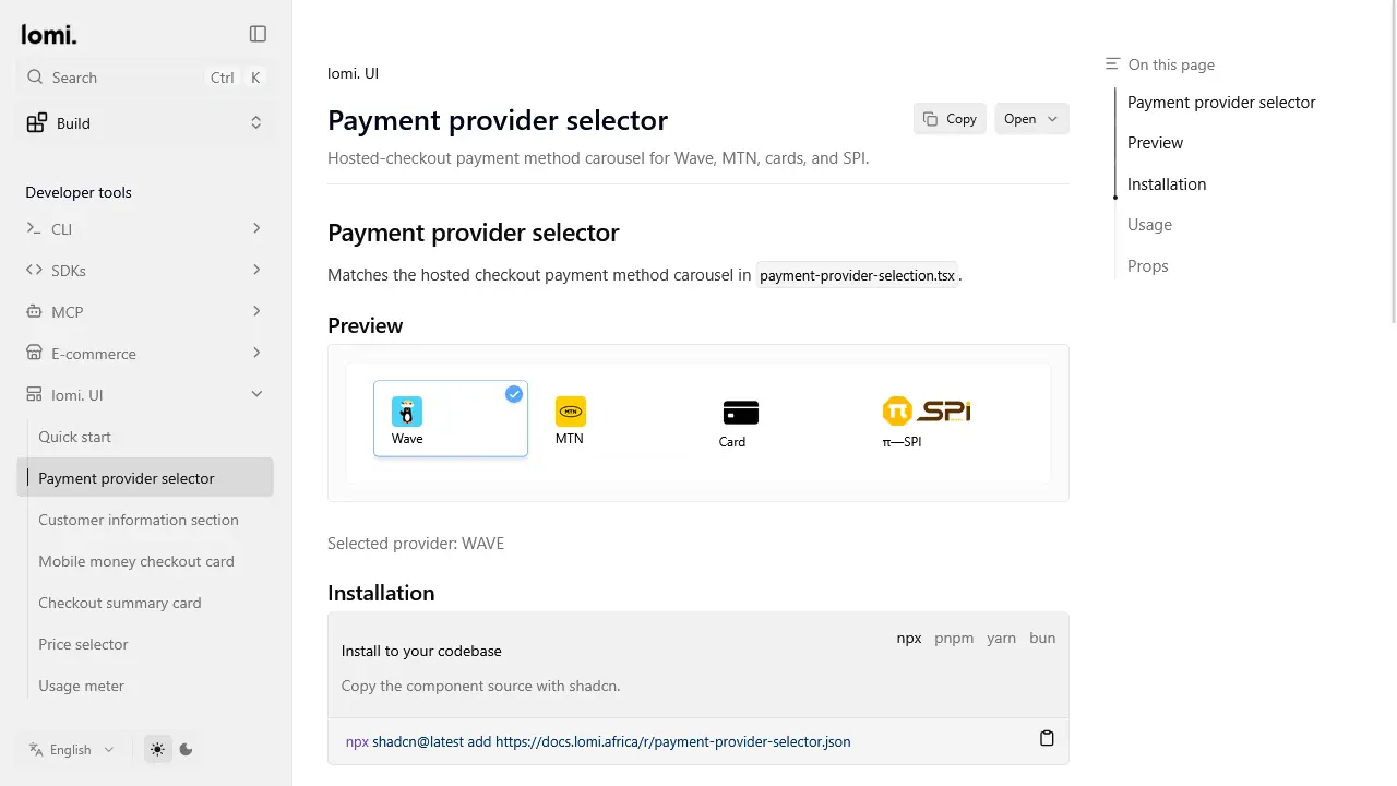
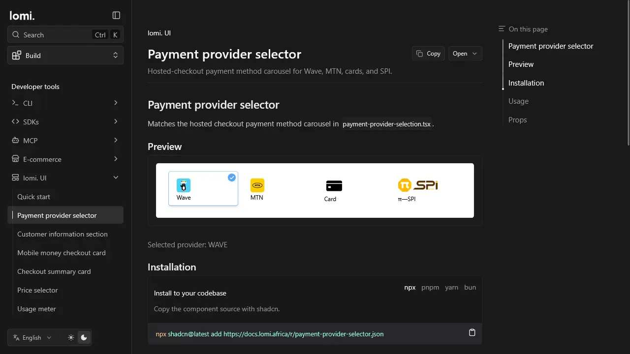
The first kit focuses on checkout:
- Payment provider selector: Wave, MTN, cards, and SPI
- Customer information section: name, email, phone, WhatsApp
- Mobile money checkout card: provider, form, and pay button
- Checkout summary card: dark product summary panel
- Price selector: billing cycle selector
- Usage meter: plan and limit tracking
Install a component
lomi ui add payment-provider-selectorEquivalent using shadcn directly:
npx shadcn@latest add https://docs.lomi.africa/r/payment-provider-selector.jsonList all components: lomi ui list. Update installed copies: lomi ui update. See CLI UI commands.
Example
import { MobileMoneyCheckoutCard } from '@/components/lomi-ui/mobile-money-checkout-card';

export function Checkout() {
  return (
    <MobileMoneyCheckoutCard
      selectedProvider="WAVE"
      fullName="Aya Konan"
      email="aya@example.com"
      phoneNumber="+2250700000000"
      payButtonBgColor="#121317"
      onSubmit={() => console.log('Create a Lomi checkout session')}
    />
  );
}
The components do not call lomi. API directly. Use your backend or SDK integration to create checkout sessions, charge requests, and webhook handling.
When to use lomi-ui vs a store plugin
| Situation | Use |
|---|---|
| WooCommerce, Magento, PrestaShop, Shopify, or Bubble store | Official e-commerce extensions |
| Custom site with minimal UI work | Embed widget |
| Full control over checkout UI in your React app | lomi-ui (this page) |
| Backend-only integration | Public API or SDKs |
Asset paths
Copy hosted checkout assets into your app public folder:
/payment_channels/wave.webp/payment_channels/mtn.webp/payment_channels/pi_spi.webp/placeholder/card.webp
Dependencies
Customer form components require:
npm install react-phone-number-input lucide-reactUpgrading from earlier lomi. UI copies
If you installed components before the hosted-checkout sync, re-run lomi ui update and adjust provider ids to match production:
| Before | After |
|---|---|
wave | WAVE |
mtn | MTN |
card | cards |
spi | spi (unchanged) |
Several checkout components now expect hosted-checkout props such as organizationName, fullName, and payButtonBgColor instead of the older simplified examples.
Design language
The components are inspired by the hosted lomi. checkout: small-radius cards, neutral surfaces, subtle borders, and #56A5F9 for selected payment states.
Hosted checkout tokens
| Token | Production value |
|---|---|
| Selected border / check badge | #56A5F9 |
| Selected background (rendered) | White, production checkout.css overrides bg-slate-100/50 on .border.bg-card |
| Selected background (source class) | bg-slate-100/50 (include checkout-ui.css or equivalent for parity) |
| Unselected border | border-border/40 |
| Unselected hover border | border-border/60 |
| Unselected hover background | bg-gray-50/50 |
| Label color on provider cards | #000 |
| Pay button default background | #121317 |
| Input border | #d1d5db (clamp(1px, 0.12vw, 1.3px)) |
| Card radius | rounded-sm |
| Provider card size | 103.25px mobile / 142px md, height 70px |
Customizing
Because each component is copied into your app, customize classes directly:
<PaymentProviderSelector
  selectedProvider="WAVE"
  onProviderChange={setProvider}
/>
Keep the #56A5F9 selected state obvious on provider cards so customers confirm the exact rail before paying.
Each component has its own page in the sidebar with preview, install command, and props.